


You know the saying, out with the old and in with the new!
And 2019 was definitely a big year of change.
With each new year, comes new changes, and we’re greatly anticipating next year’s big design changes.
But until then, we want to reminisce and talk about the best 8 logo redesigns in 2019.
There were some pretty big and iconic changes that happened this year, and we’re going to go over all of them.
Logo redesign is a common practice because no matter how good your logo looked when you created it, in most cases, it’ll become dated.
With new trends coming around every season, and with new things being implemented into a business, it’s hard for a logo to stay relevant and fresh.
So today, we’ll be going over the top 8 logo redesigns of 2019.
Let’s get into it.
Warner Bro’s
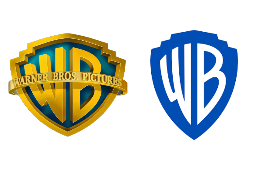
Warner Bro’s logo redesign was a shocker for all of us. After a century of having the same iconic logo, they decided it was time to make the logo a little more versatile.
With a new shade of blue, a little reshaping of the shield, and a new flat design, I can say that Warner Bro’s was definitely my favorite logo redesign of 2019.
What do you all think of the new design? Let us know in the comment section below what your first impressions were.
Volkwagen
![]()
[source]
Another recent and iconic logo redesign was from Volkswagen.
Volkswagen, being internationally renowned for its cars, definitely doesn’t need much of an introduction from us.
Volkswagen stated the following in their press release regarding the new logo.
“The new brand design marks the start of the new era for Volkswagen,” says Jürgen Stackmann, Member of the Brand Board of Management responsible for Sales, Marketing and After-Sales. “By formulating new content and with new products, the brand is undergoing a fundamental transformation towards a future with a neutral emission balance for everyone. Now is the right time to make the new attitude of our brand visible to the outside world.”
[source]
We’re happy with the steps that VW is taking to help the environment. And we also like the new flat and versatile design of the logo.
A new era, a new logo.
Firefox
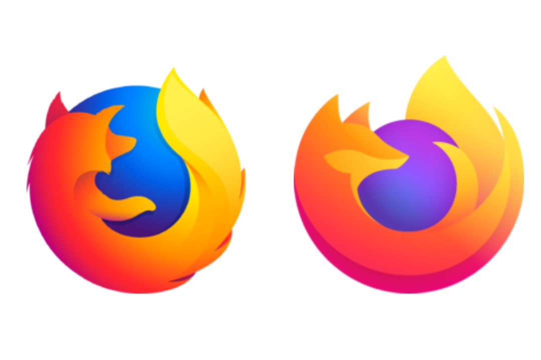
When we heard that Firefox’s new logo was accidentally leaked via Twitter over the summer, we were actually thrilled.
With every new redesign Firefox goes through, it continues to get sleeker and sleeker.
The fox obviously had some grooming over the summer, as its coat is much smoother now. The gradient is very very similar to the old one, and now we can actually see the sly fox’s face.
Overall, we’re very pleased with the facelift that Mozilla underwent, and we’re looking forward to what they’ll put out next.
Grey Goose
![]()
Oh Grey Goose, you beautiful bottle of fun and joy.
Grey Goose also went through quite a surprising redesign this summer.
They left all their former, intricate designs behind and embraced minimalism in their design.
But not only did they embrace minimalism in their graphic design, but also in their wording.
And as we said in a previous article all about their redesign, this still rings true.
“From a marketing perspective, the shorter tagline that spells just ‘Vodka’ now instead of ‘World’s best tasting Vodka’ makes a lot of sense. Most people shop for alcohol based on the label. In recent years, more and more consumers will go for a more minimal tag.”
Minimalism is definitely a trend we’ve been seeing all throughout 2019.
Let’s see what we have up next.
Discovery Channel
![]()
[source]
Next up, it’s time to “discover” another logo redesign. See what I did there?
I need to stop.
Anywho, Discovery came up with a new logo design. They ditched the 3D world model and went for a flat design. They also shortened it by removing the stand alone D and just including the logo in the actual written word.
If I’m completely honest, I think I like the previous logo design better. What do you guys think?
Slack
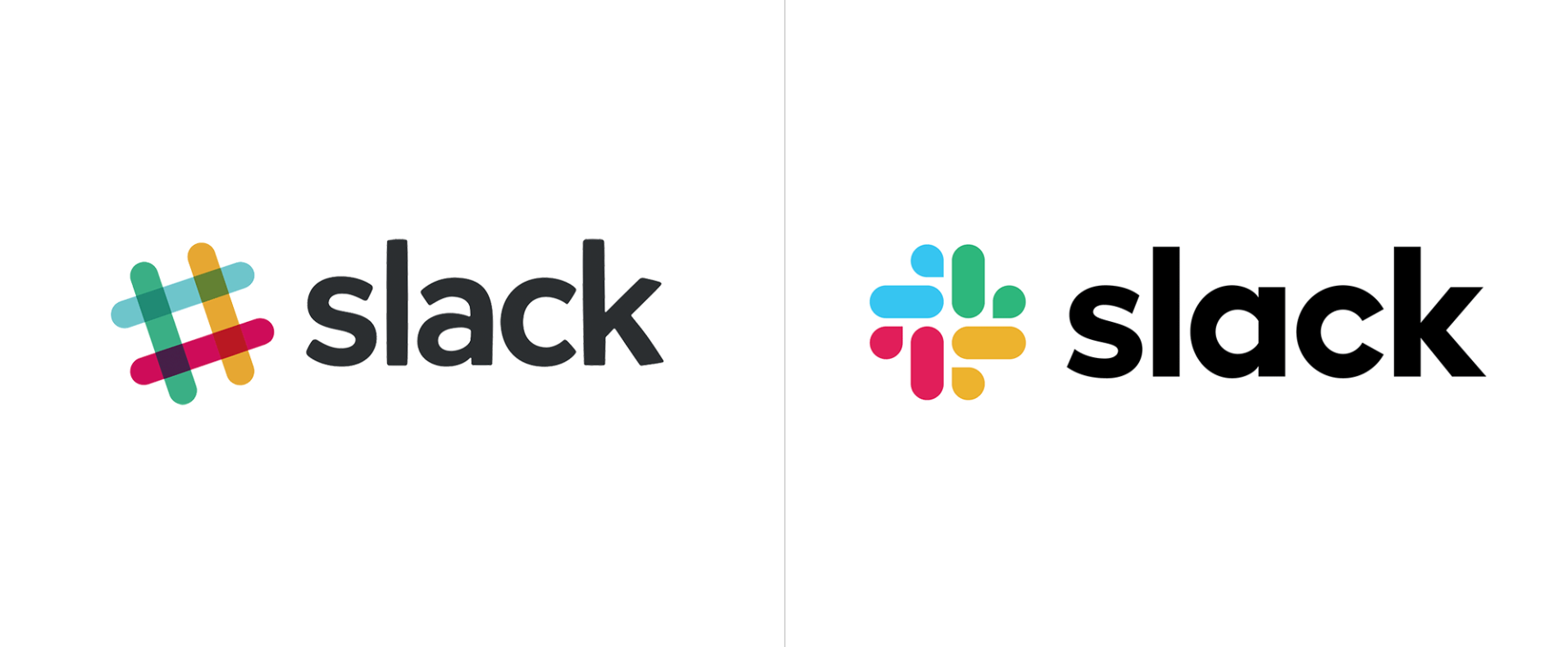
Alright, let’s cut them some “slack” with the new logo design.
I’m kidding you guys, I really like the new look of their logo. I really need to quit on these puns.
We all know and love Slack and loved the liveliness of their logo. I genuinely can say that I vouch for both logos! But let’s hear what Slack themselves have to say about it.
“Our first logo was created before the company launched. It was distinctive, and playful, and the octothorpe (or pound sign, or hash, or whatever name by which you know it) resembled the same character that you see in front of channels in our product.
It was also extremely easy to get wrong. It was 11 different colors—and if placed on any color other than white, or at the wrong angle (instead of the precisely prescribed 18º rotation), or with the colors tweaked wrong, it looked terrible. It pained us.
So here we are. Our in-house design and brand team, together with Michael Bierut and the team from Pentagram, worked to create a new and more cohesive visual identity. And we’re starting, today, with the logo. It uses a simpler color palette and, we believe, is more refined, but still contains the spirit of the original. It’s an evolution, and one that can scale easily, and work better, in many more places. “
[souce]
So there you have it!
Reebok
![]()
Whether you’re in dance, track, crossfit, or yoga, Reebok has the shoes for you.
They also went through quite a big design change this year.
The iconic Delta sign in their old logo has taken a back seat to the new design.
The new design is actually just a return of their design from 1990, with some nice tweaks.
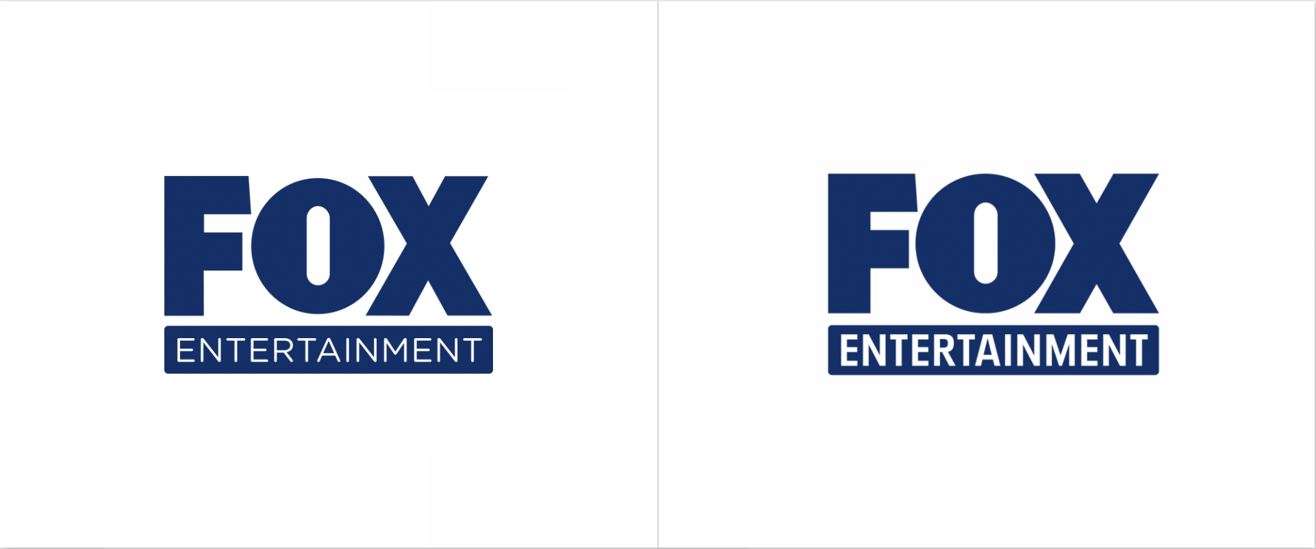
Fox Entertainment
[source]
And finally, we come to our final logo redesign.
Some logo redesigns require an entire make-over, and others just need a little, teeny-tiny tweak.
Fox Entertainment went for a tiny little tweak.
The Entertainment text is the main change.
They changed the font and they also made it quite bold.
It definitely is more eye-catching now and looks a lot better.
Sometimes all you need is the smallest adjustment to make a huge difference!
And Finally…
We hope you guys enjoyed our collection of logo redesigns. We are looking forward to a brand new year and a new start in 2020.
Let us know what your favorite logo redesign of the year was!
Happy holidays!
