


Your product could be the most amazing and useful product in the world, but if your packaging is not on point, then your entire business could be in some major trouble.
Imagine this scenario: You’ve designed the best product in your field, invested all of your funds into creating the product, and put packaging design on the back burner. You get on a free mock-up website, make something in an hour, call it day, and show it to your investors.
Terrible idea.
In my personal opinion, you should put just as much effort into the packaging design of your product as you put into the product itself.
According to science, it only takes a person 1/10th of a second to create or form an opinion about someone or something. That gives you literally not even one second to give someone a great first impression.
The first thing your potential customer is going to see is your packaging. And you better hope to goodness that you’ve aced your first impression and wowed your target audience with your packaging design.
Best Packaging Design Ideas for 2019
I’ve rounded up 20 of my favorite packaging designs for you to be inspired by for your next design project.
Let’s check em out!
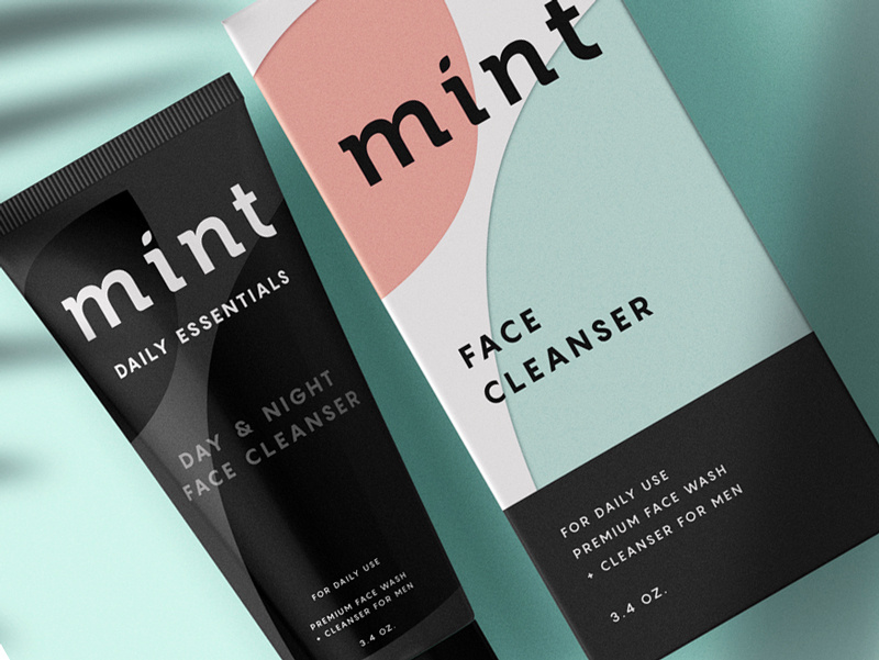
1. Mint
[source]
This face wash for men is so simplistic in its design that it’s easy and enjoyable for the eye to look at. The black color of the face wash gives off tones of luxury and the pastel colors on the box, combined with flat design, simply works for this packaging.
2. Care Market
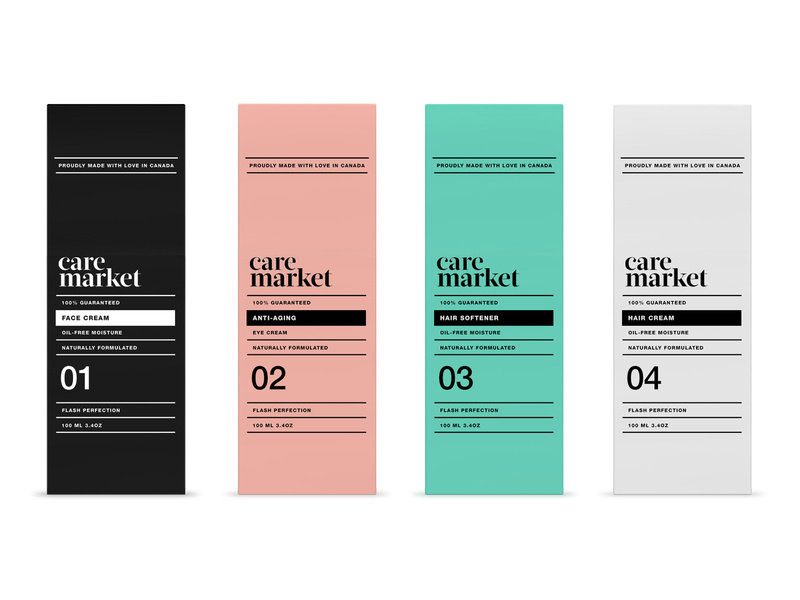
Continuing on with the pastel trend, we have Care Market packaging design. The palette they chose here is lovely, as pastels have been all over the place this year. The consistency in font usage is just perfect, using only two different fonts and using dividing lines between each new phrase.
This packaging design shows us that you don’t need elaborate graphic designs to exude elegance and professionalism. All you need is a great color palette, and nice, coinciding fonts.
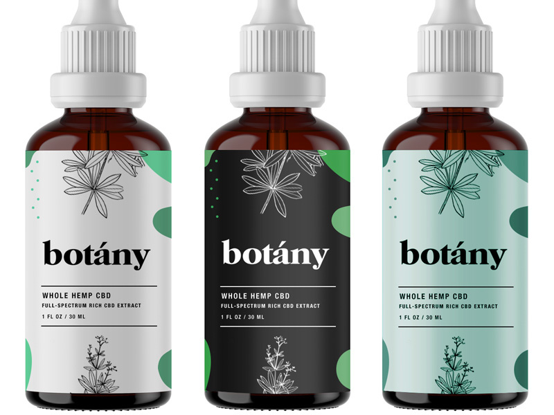
3. Botany
[source]
Less is more, as the saying goes, and botany nailed it. Minimalist, flat design is the key here and with three different color schemes that all complement each other, I can wholeheartedly say, I believe this design will catch the eye of anyone who is looking for a high-quality serum.
4. Roji
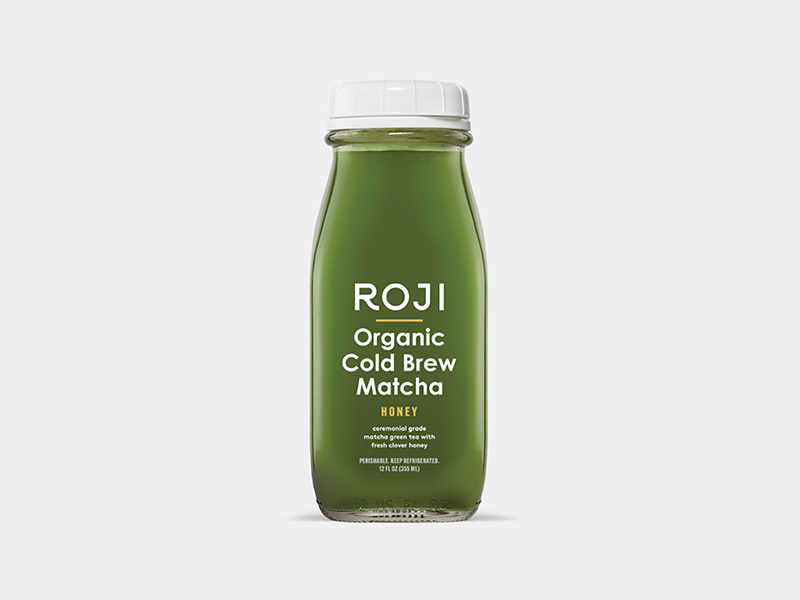
When someone is looking for a healthy drink, they’re going to be looking for sleek, professional fonts that look organic. My favorite part of this packaging design is that the designer thought through the choice of font colors.
Since the bottle is made of glass, you’ll be able to see its contents and the yellow font matches the beverage inside the bottle. The yellow-colored font perfectly complements the contents of the bottle. A simple, well-thought-out packaging design overall.
5. Sophia’s Tea
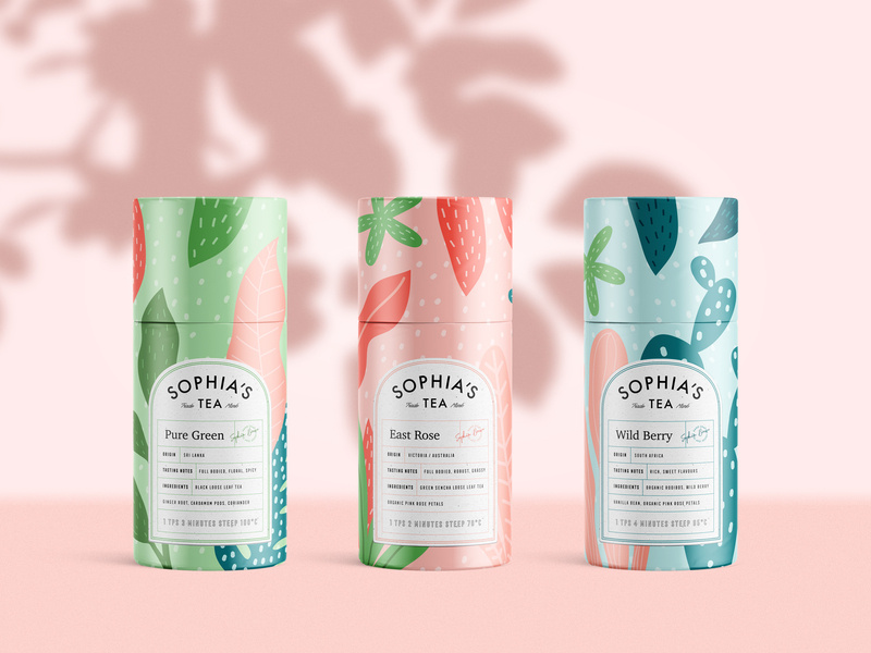
Stepping out a little bit from the pastel color palettes and into something a little bolder, we have Sophia’s Tea packaging design. Flat design really has taken the lead in 2019. We see it all over the place. And luckily for us designers, it makes our job a little easier.
What I appreciate about this design is that the name of each drink matches the design of each recipient. The color scheme on each bottle matches each other, making a buyer recognize the brand, if they were to see each bottle on a shelf in a store.
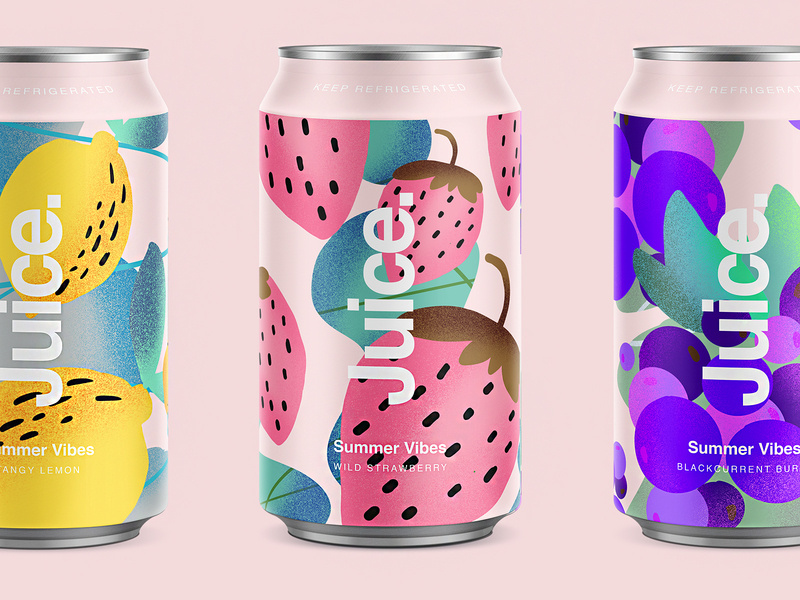
6. Juice.
Since we’re on a drink roll, check out this summery packaging design for juice. Again, we’re hit with flat design and beautiful colors. The font sticks out perfectly on the foreground of the design. Juice. Simple, clean, clear, and to the point.
7. Brightland
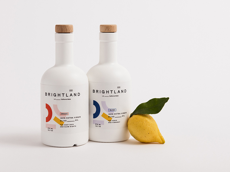
I’ve never seen an olive oil packaged quite like this. At first glance, you would wonder what this beautiful bottle is doing in the oil section.
You’re inclined to pick it up, you read that it’s olive oil, you’re shook, you compare prices between this and another oil, you realize it’s the same price, and naturally you buy the more beautiful packaging design of the two products. Hit people with original, innovative designs and you’re sales will skyrocket.
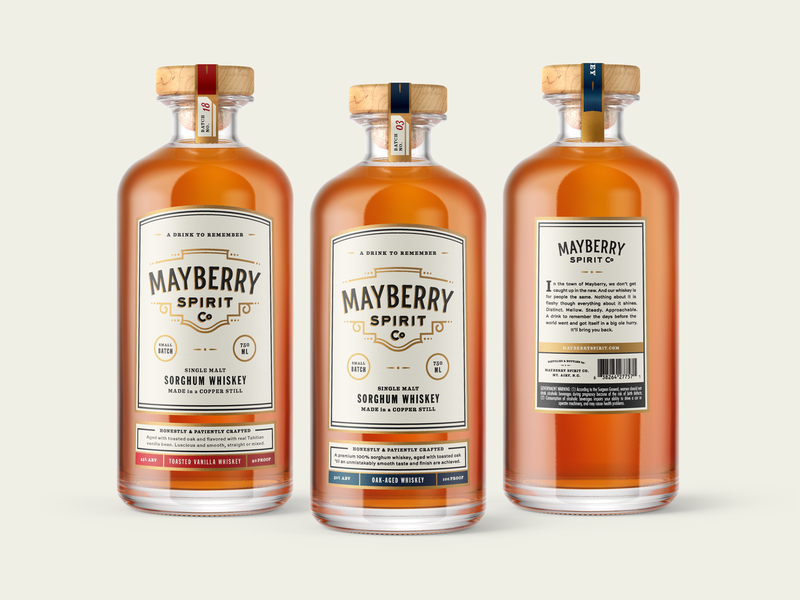
8. Mayberry Spirit Co.
[source]
This bottle makes me want to have a nice, classy night at home with all my friends. The vintage font works beautifully with the design of the bottle, and I love that the color schemes match the rich color of the whiskey itself.
9. Gatorade
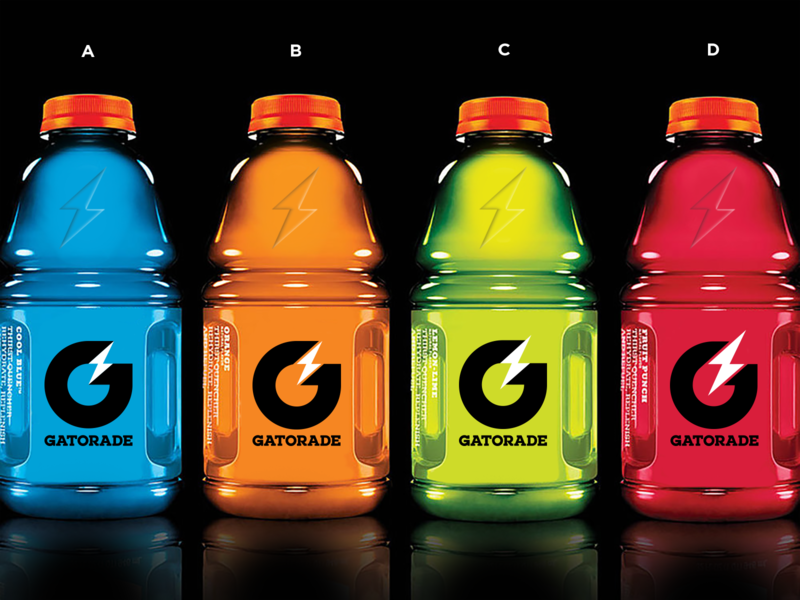
Here are some rebranding sketches for Gatorade. Simple design that gets across, yet still embraces the originality of the Gatorade logo. You won’t lose any brand recognizability, and it looks more modern.
10. The Restored
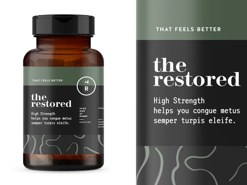
The packaging design for these vitamins is everything. The manly, muted earth tones will remind a person of organic produce, making them trust your brand even more. Color association is very important when it comes to designing your packaging and establishing your brand, so choose wisely!
11. The Restored
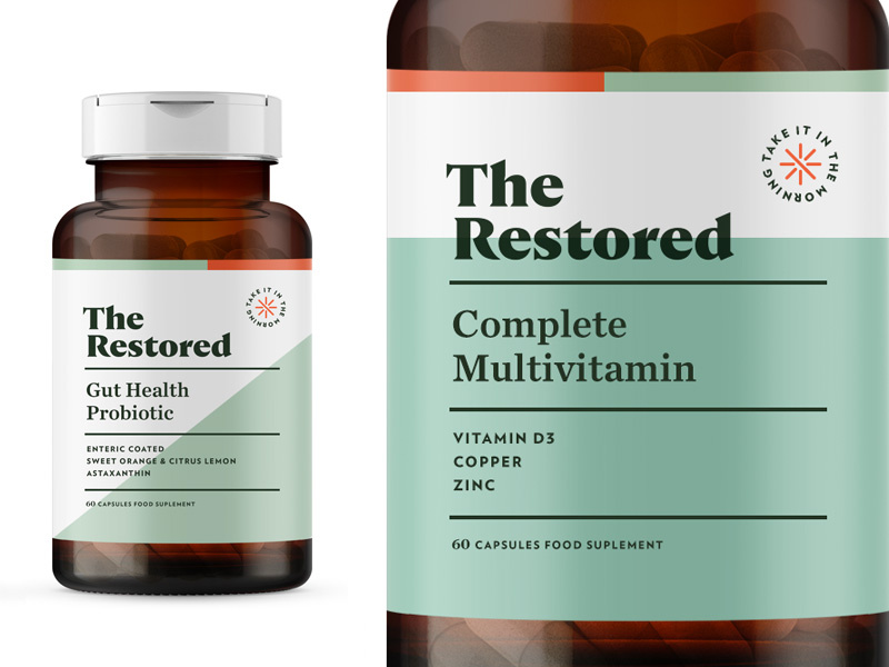
Here’s a second version to Restored vitamins. This packaging design is a touch more feminine, using a more pastel green, and creating more dimension in the background by using two different colors. The pop of orange in the corner brings the eyes to the directions.
12. American Crew Fragrance
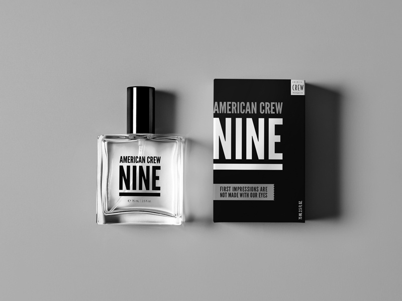
This simplistic design is one way on the box and reversed on the bottle. By using one font, they really had to play with the scaling and spacing of letters and words to make it interesting and captivating. Again, packaging design can be simple and just as engaging as a super complicated design.
13. Roys Morning Serum
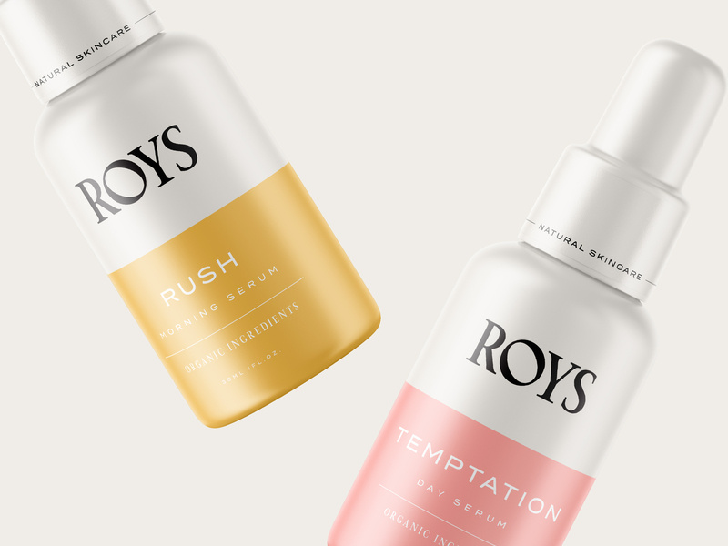
Roys morning serum has two beautiful colors: a muted pink and a relaxing gold. Color association is everything. If you can convince your customers that your product is what they need and you really sell your product by having a luxurious packaging, you’ll have clients talking about you for days.
14. Zinus
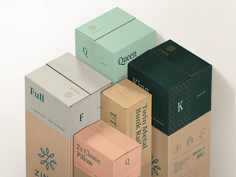
You can recognize an eco-friendly package design from a mile away, and most people are becoming very concerned and aware of their consumerism and trash contribution to the world. Using a bio-degradable packaging or using recycled material will help you loads when it comes to sales. And you’ll be helping the world. It’s a win-win.
15. Mapuche Maqui
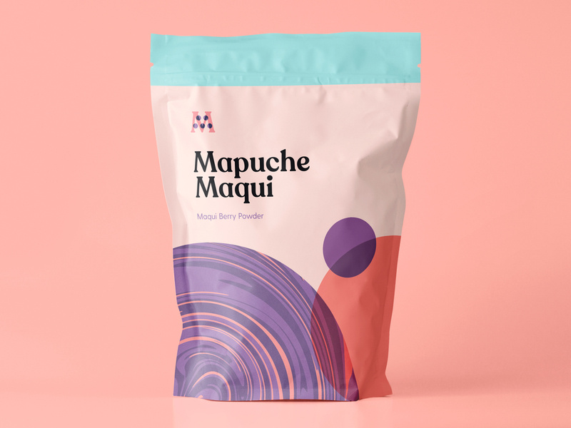
Sometimes, making healthy choices isn’t the easiest or most fun, so presenting a fun looking health product can be key in your sales. This berry powder packaging design looks fun and friendly, used flat design, a beautiful color palette, and bold font. With all these elements combined, surely it’ll catch the eye of a customer.
16. Botanical Coffee Co
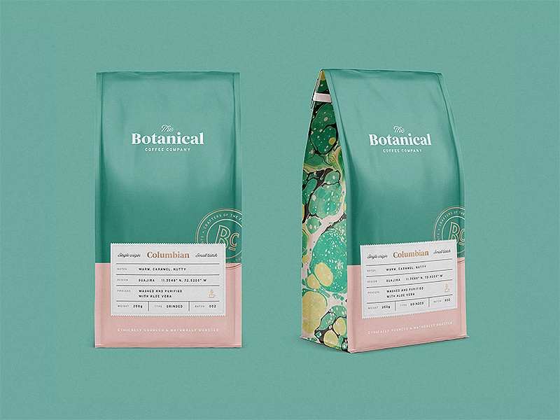
This coffee design is so relaxing to look at. The intricate design on the sides, the simplicity on the front, and the choice of font combinations are just lovely. Again, going with flat design and pastels. See the pattern?
17. Publix Cereal Line
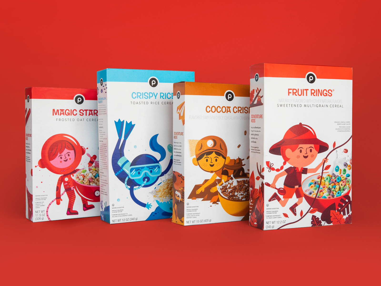
Did you know that the color red increases your appetite significantly? The designer here for kids cereal certainly knew what they were doing. By combining real-life elements and flat design, kids will surely be intrigued by this design and be inclined to beg their parents for the cereal.
18. Coffee
This coffee packaging is so bright and captivating, yet still has colors that are easy on the eyes. When choosing your color palette, you need to be sure that you’re choosing colors that soothe and colors that people want to look at. And of course, brand colors that represent you and that your audience will enjoy.
19. Tesco Fish
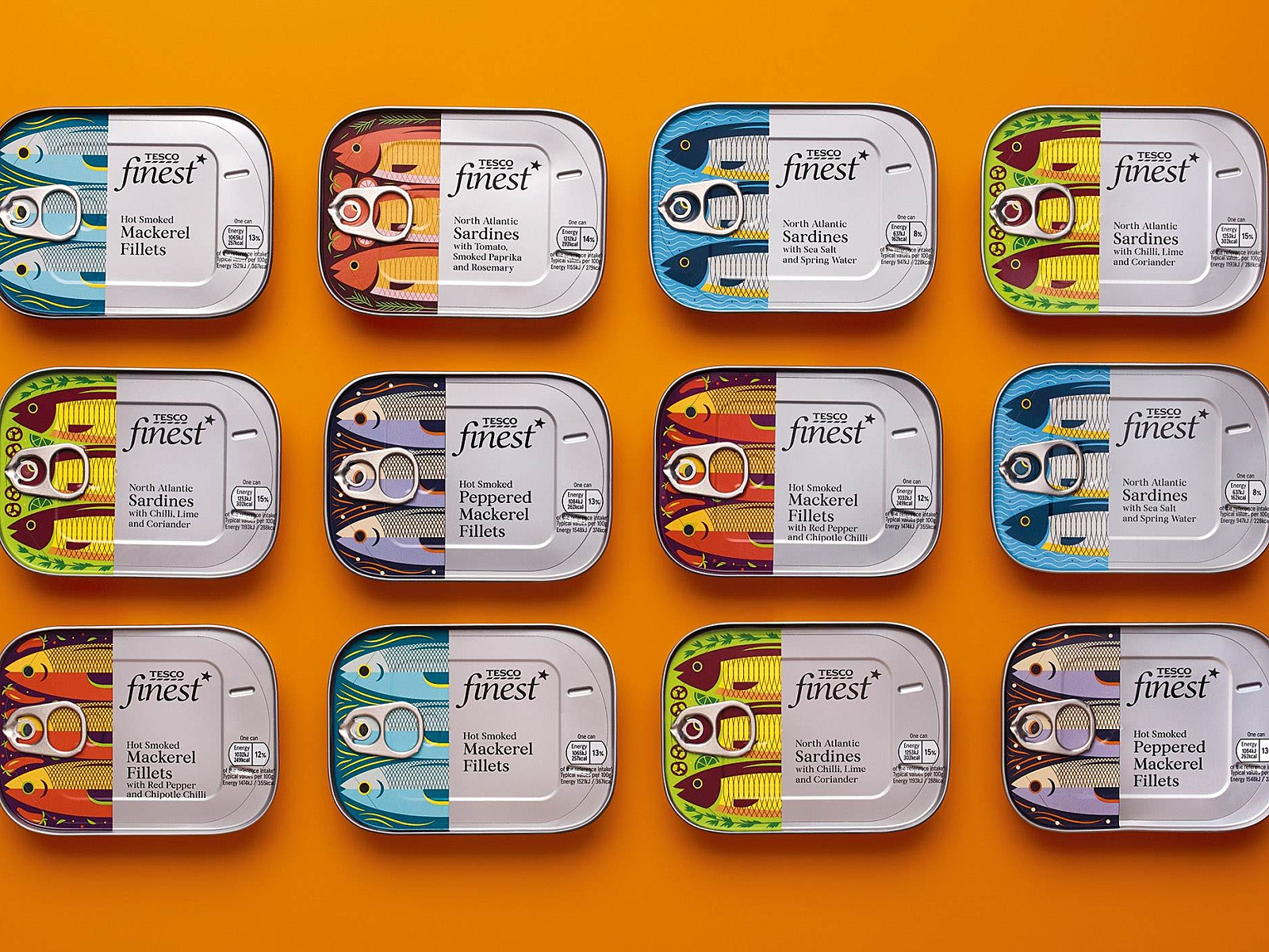
Check out these “fishy” illustrations! What I really enjoyed about this packaging design was the fish. I love the very finely defined, cut-off design of the fish, and then the can and text. Each fish is design to represent its kind, and I find this design very creative, colorful, and appetizing.
20. Moon
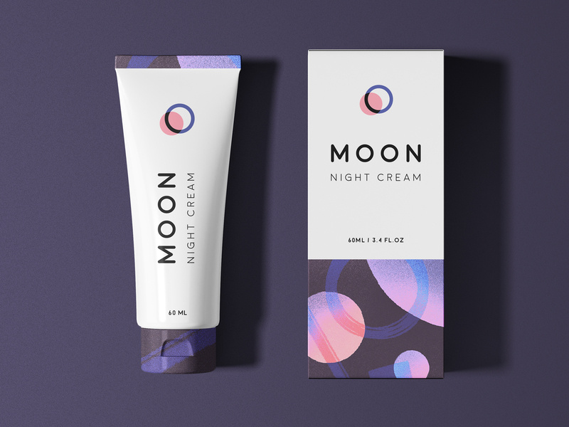
And finally, we have Moon Night Cream. Notice how to colors and graphic designs represent the night. So simple, clean, and fresh-looking that you actually can’t wait to use this cream tonight before bed.
Wrapping things up
As we all know, packaging is everything when it comes down to actually selling your product. Make sure your design represents you, your brand, and your product, and is creative and makes people feel like they need what you have to offer, in their lives.
I hope you found this article inspiring and you’re more than ready to jump into your next design project.
Until next time,
Stay creative!
