


What is a logo? Basically, it is a symbol, a text, or a combination of the two that helps us identify a brand. The latter is not just a logo, it is the general way in which customers perceive you.
This includes the way of communication, promotional materials, images, products or services, physical stores or online stores, and more.
Why is it important to have a logo? Representing the “face” of your business, it is necessary for the purpose of identifying, differentiating competition, constant communication and loyalty.
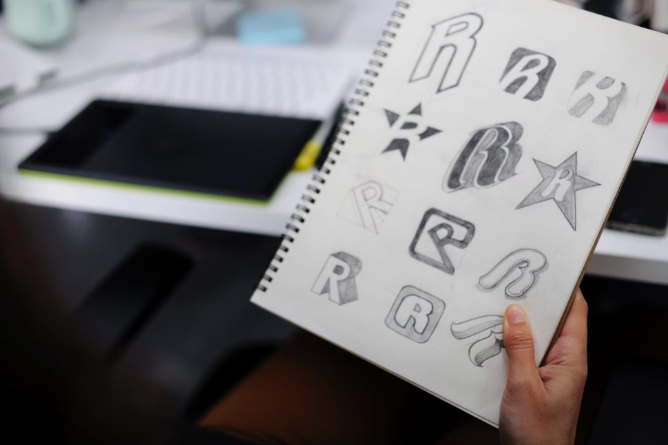
With that in mind, let’s talk about 10 of the biggest features that should go into a logo:
Represents the niche and the target audience
The features of a logo must depend on the niche and the target audience accordingly. That’s why a marketing brief is the basis for creating a good logo.
For a specific example, let’s use a heavy metal band’s logo. The band’s logo might look ugly and grotesque to some, but it’s exactly what it should be for their target audience.
It is adaptable
A good logo can be easily used in the online environment, embroidery, huge banners, small labels, business cards, bottles, you name it. Keep in mind that you need a logo in vector format, not just .png or .jpg, because this format offers scalability. Do not forget to always ask the graphic designer.
In this regard, you really should consider working with a graphic designer. Remember, your logo is the face of your company. It’s the thing that almost every customer sees before they even know what you do as a company. Spend the extra time and money to get it right the first time, and avoid having to spend more time and money in the future.
It differentiates you from the competition
First, to differentiate yourself, you have to know your competition. Considering the multitude of existing business and logos, it is extremely important to assume your own identity and not to copy it from others. Of course, in this case, differentiation must target the niche and the target audience. To continue with the previous example, heavy metal logos do not fit a law firm.
It is timeless
Trends come and go, but your logo does not have to be based on time preferences, but it has to pass the test of time. Of course, many businesses change their logos through rebranding campaigns, because they have changed their values or just because they originally made a trendy logo.
A good example of a timeless logo is the Coca-Cola logo. Since its creation in 1887, it’s kept roughly the same design. It’s easily recognized, and it stays up-to-date.
It’s memorable
The memorable character of a logo can be provided by simplicity, uniqueness, color, hidden elements or many other features. The customer will choose a brand they know and trust, and ultimately become faithful to your brand.
Leave a lasting impression, and gain a lasting customer.
It’s read easily
Handwriting fonts can be beautiful for a particular audience, but they are often hard to read and therefore hard to remember and perceive. If a font is not readable at a comfortable size, how does it look on a business card or a mobile site?
Again, keep it simple and clean, and you’ll avoid this mistake.
It doesn’t describe the business
Just because you deal with car production does not mean that your car needs a car illustration. Of all existing car brands, none of them include the main subject of their business (except those that make toy cars).
Many graphic Murfreesboro web designers (or business owners) tend to make the logo descriptive. This might not be considered a mistake, but, more often than not, it comes off as a generic looking logo. It usually limits you to certain services, which can prevent the expansion of your business.
It’s smart
A visible concept is not a must, but it’s a plus . A logo that contains a surprise item or something that needs to be discovered generates interest (have you ever noticed the arrow in the FedEx logo?). But one element is more than enough. Many times, Murfreesboro web designers take this idea too far, and overcomplicate the logo.
Contains the appropriate fonts and colors
Fonts and colors are excellent forms of communication. For example, a handwritten font is more feminine and personal, usually unmatched in a corporate logo. Every color has its psychology, which is dependent on culture. In this sense, have you ever wondered why most corporations have the blue logo? The answer is simple: because blue inspires confidence and is a favorite color of both genders.
It’s not complicated
Too many fonts, colors, elements, symbols, or slogans can complicate the design. This leads to a hard-to-remember and unidentifiable logo.
The summary
Now you know what a logo is, why it is important to have one, and what the characteristics that can fit it into the category of good ones are.
There are lots of examples of great logos out there. I’m sure you can think of a few right off the top of your head right now. But, for every good example of a logo, there’s at least one bad example. Avoid being one of those bad examples, and stick to these 10 features.
